
Branding is More Than a Logo
Jun 8, 2025
11 min Read
How to Craft a Visual Identity That Makes Your Photography Brand Unforgettable
A great photo makes you feel something. A great brand makes you remember who made you feel it. Your visual identity isn’t just what your feed looks like—it’s the emotional fingerprint you leave on every image, every caption, every corner of your online presence.
So… what’s yours saying? What Is a Visual Identity? (Hint: It’s Your Vibe, Not Just Your Visuals) Let’s get this out of the way—your logo isn’t your brand.
Your visual identity is the entire sensory world you create around your work. It’s the mood your website gives off before someone even sees your portfolio. It’s the tone in your captions. It’s the editing style that makes people scroll back to figure out if that shot was yours—and yep, it is.
Think of your visual identity as your photographic vibe. It’s style, yes. But also energy. Consistency. Emotion. And trust.
How to Find Your Visual Voice
Before you go full mood-board mode, take a step back. Your visual identity should feel like you, not like a watered-down version of your favorite Instagrammer.
Here’s how to get started:
1. Gather inspiration, then subtract: Use Pinterest or Behance to collect images that move you—not just photos, but posters, films, book covers. Then, remove everything that feels like a copy of someone else. What remains? That’s your true visual gravity.
2. Ask what emotions you want your work to evoke: Romance? Stillness? Energy? Grit? Your brand should make people feel something specific. Emotion is the anchor.
3. Pick 3 “Style Pillars” These are your foundation. Example:
Soft light
Muted tones
Intimate moments
Everything you post, build, and share should reflect these.
Staying Cohesive with the Right Tools
Having a strong identity doesn’t mean you lock yourself into a box—but it does mean you make strategic decisions. Here's how to stay consistent:
Framer: Build a website that reflects your exact vibe. Use custom fonts, on-brand colors, and immersive image layouts.
Behance: Showcase your work in a way that tells a visual story. Behance is not just a portfolio site—it’s a stage.
Pinterest: Use it to spot trends you actually resonate with. Create private boards that keep your identity in check.
Think Beyond Presets: Your Signature Style Elements
Want to stand out without saying a word? These are the subtle cues that make your brand yours:
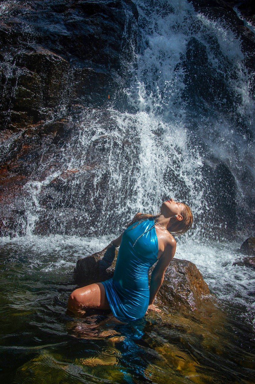
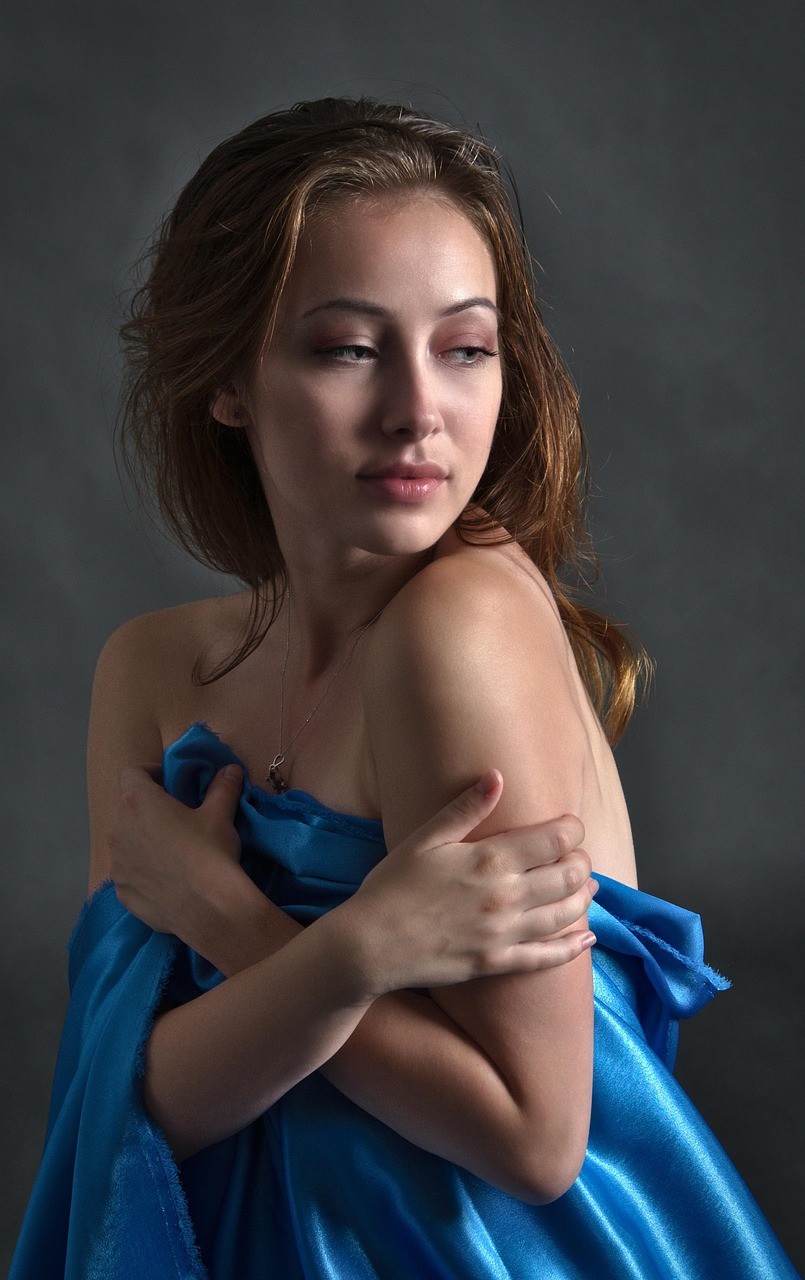
Brand Colors: Don’t just pick what’s trending. Choose tones that reflect your message. Earthy neutrals = timeless. Rich blacks and golds = luxury. Pastels = softness. Electric tones = bold storytelling.
Tone of Voice: Do you write captions like a poet? A minimalist? A mentor? Let your words echo your visuals.
Shot Types: Are you known for tight, moody closeups? Wide, storytelling frames? Studio perfection? Outdoor rawness?
Editing Accent: This is the sauce. The way you play with contrast, grain, white balance. Develop an editing accent, not just a preset. Something that evolves with you, but still feels unmistakably yours.
Final Thought
Your camera may shoot like everyone else’s. But your brand? That’s the part no one can replicate. The most memorable photographers don’t just take great photos. They create a world.
Build yours, one deliberate visual at a time.
BASED IN Los Angeles,
CALIFORNIA

Peter jacobs,
photographer